Website Review - Business Directory Nepal
The theme for this month is
"Business Directories (Yellow Pages) of Nepal"
Connection Yellow Pages
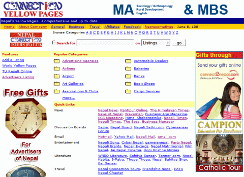
The oldest yellow pages directory of Nepal, started in 1991. On the website you can search the directory from search box, alphabetical listing and popular categories.
I personally found their advertisements to be more highlighted and the main directory less highlighted. Even the fonts are so small. And the add listing link is not easily viewable either.
Nepal Home Page Yellopages
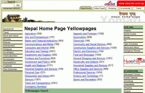
Another popular yellow page directory of Nepal. The homepage makes you feel there are lots of listings here than in other directories. The directory is simple and effective - there are lots of categories you can choose from right at the homepage (along with number of listings under that category). A click on the category takes you to the sub category page, from where you can choose your listing. The listings are shown in table form, from which you can select the desired company for more details.
There is also a search box at the botton, though not so prominent. Also the add edit link is not easily visible. Other useful links at sidebar are also nicely highlighted. One thing missing perhaps is browse alphabetically or other methods of browsing.
Nepal Yellow Pages Business Directory
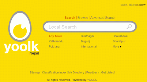
Probably the simplest yellow page directory. There's a big search button at the front page, as well as an advanced search option, based on city name, address etc. Then there browsing option by categories, which take you to sub categories page and then the individual listing. Couldn't be more easier and to the point.
Another interesting function for this directory is the membership. The site uses lot of AJAX like fancy technologies, which make the site browsing easy and fun. Once being member there are other functions like bookmark individual listing for further use. You can also select the listings directly from the Classification Index page. And getting listed is quite easy as well. You can even manage your own gallery and profiles. Pretty cool site from yoolk I must say. The site even has a yellow color theme for yellow pages. Just that the spelling of "yolk" is incorrectly mentioned as "yoolk". How lame!
Want to feature your website or blog here too? Drop a mail at nepalsites@gmail.com with some description about your website with the subject line "Website Review".
